Living room photo enhancement
Balance the widest, brightest, most distorted room in the set.
Correct wide-angle stretch, hold the window and the room in one exposure, and let furniture read at its real scale.
The room that sets the perceived size of the whole property, shown accurately.
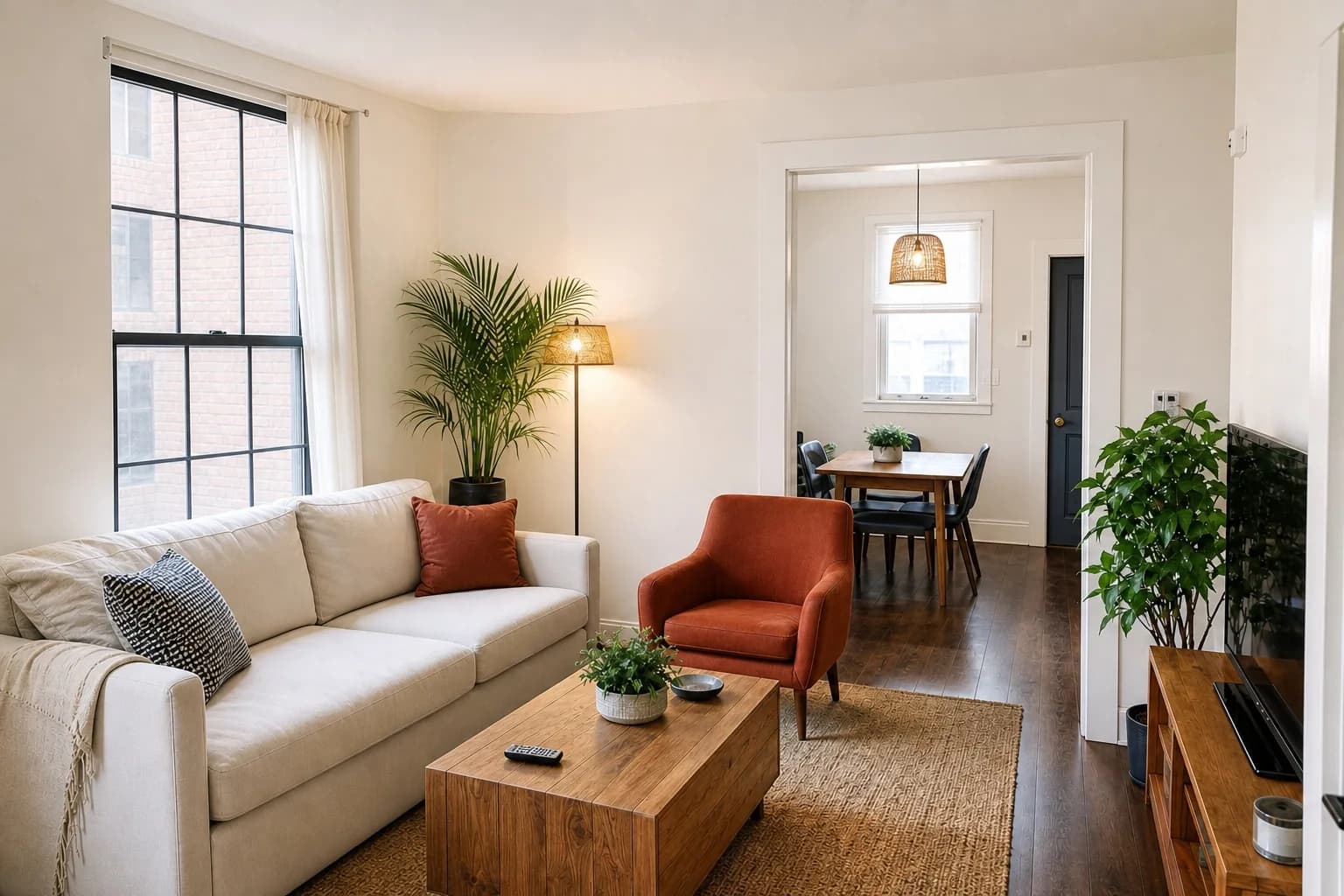
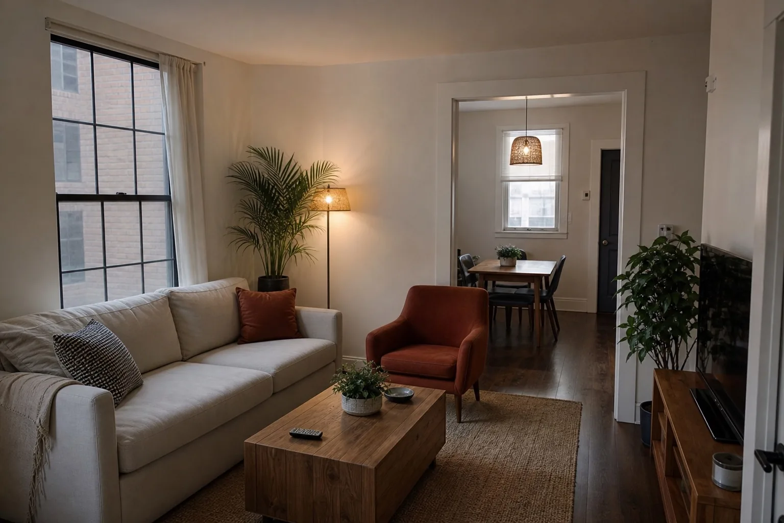
The problem
The widest room takes the widest lens, and pays for it.
Living rooms get shot from a corner with the lens at its widest setting, which stretches whatever sits nearest the camera. A sofa arm two feet from the lens becomes the largest object in the property. The room looks bigger and the furniture looks wrong, and viewers register the second thing without being able to name it.
Our method
Fix the geometry first, then reconcile the window.
ListPik corrects converging verticals and reduces barrel distortion before any tonal work, because straightening after brightening reintroduces edge artefacts. Once the room is square, the window and the interior are balanced as one exposure rather than two competing ones.
The living room sets the scale for everything else
Viewers calibrate their sense of a whole property from its main living space. If the living room reads as generous, the bedrooms are forgiven for being modest. If the living room reads as cramped, every later photo is judged against that first impression. This makes it the room where exaggeration is most tempting and most damaging, because the correction from photo to viewing is felt across the entire property rather than in one room.
The honest version of making a living room look good is geometric rather than optical. Straight verticals, a level horizon, and furniture that sits at plausible scale make a room read as well-proportioned. Widening the lens makes it read as large and then disappointing.
Televisions, fireplaces, and other black holes
A switched-off television is a large black rectangle that drags the average exposure of the frame upward as the camera tries to compensate. So does an unlit fireplace or a dark bookcase. The room ends up overexposed around a feature that still reads as a void, and lifting the shadows further just makes the void grey rather than black.
These are best handled locally. The rest of the room can be balanced normally while the screen or hearth is left dark, because a dark screen is what a viewer expects to see. What should not happen is a screen that has been filled with content that was never there.
- Shoot from the corner that shows the window wall and the main seating together
- Keep the camera level; tilting up to fit the ceiling is what bends the walls
- Pull furniture a few inches off the walls so the room reads three-dimensional
- Take a second frame from the opposite corner for open-plan spaces
Where it fits
Use enhancement when the photograph is the problem.
Wide-angle distortion dominates
The room was shot from a corner and the near furniture is visibly stretched.
The window blew out the room
One exposure could not hold both the glass and the interior.
Verticals are leaning
The camera was tilted to fit the ceiling and the walls now converge.
A three-part desk
Fast enough for the deadline. Deliberate enough for the listing.
- 01
Upload the original
Use the largest source file and choose an interior or exterior finishing direction.
- 02
Review the evidence
Inspect the result beside the source. The property should remain immediately recognizable.
- 03
Export with context
Download the approved image and follow the disclosure rules that apply to your listing.
Desk specification
What goes in, what comes back, and what to inspect.
Useful limits are part of a reliable workflow. Start from the best available source and approve the finished frame against visible property facts.
Before you publish
- Confirm the near-corner furniture has not been left stretched by the lens.
- Check verticals on door frames and window reveals are parallel to the frame edge.
- Verify the view through the window is the same view, at the same brightness relationship.
- Look at the image at thumbnail size — the main seating area should still be legible.
Specific answers
What to know before processing.
Why does my living room look distorted in photos?+
A wide lens close to furniture stretches whatever is nearest the camera. Backing off slightly and correcting perspective afterwards gives a truer sense of the room's proportions.
Should the television be on or off?+
Off. A switched-on screen dates the photo, distracts from the room, and creates a colour cast. A black screen is what viewers expect.
How many photos does a living room need?+
Two for an open-plan space — one toward the window wall and one back toward the entrance — so viewers can assemble the circulation without guessing.
Start with one frame
Let the comparison make the case.
Packs or optional monthly. One credit per finished photo. Review before you publish.
Open the studio