White balance
Remove yellow and blue casts from listing photos.
Correct mixed daylight and indoor bulbs so walls, fabrics, and finishes read as their real colors.
Accurate color makes a property feel cleaner and more trustworthy.
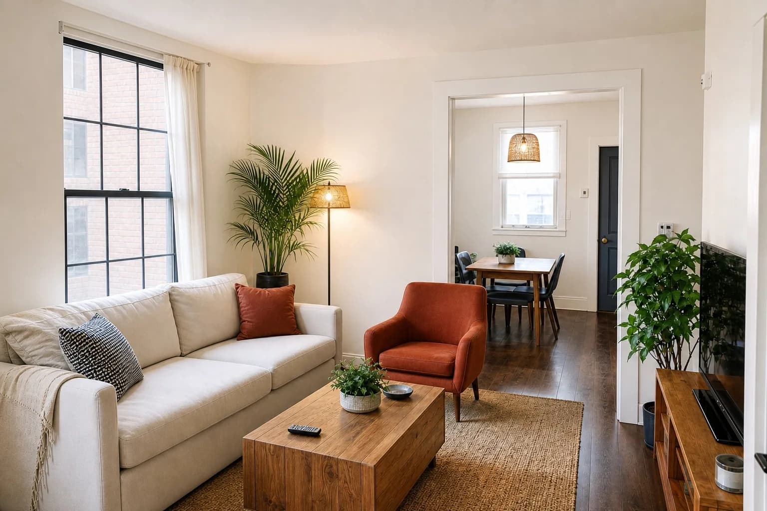
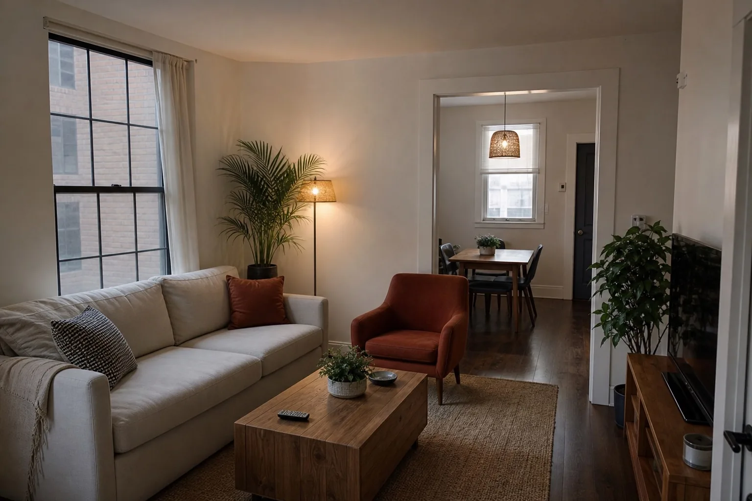
The problem
Your eyes adapt to a room. Your camera does not.
Warm bulbs, cool daylight, and reflective surfaces can push one photo orange and the next blue. A listing assembled from inconsistent color temperatures feels unprofessional even when every image is sharp.
Our method
Correct the cast, keep the materials.
ListPik identifies likely neutral surfaces and balances color around them. It avoids the sterile gray result of aggressive auto-white-balance and keeps warm materials warm where they should be.
The camera needs something it knows is neutral
White balance works by identifying a surface that should be colourless and shifting the whole image until it is. In a property photo that reference is usually a white ceiling, a white door frame, or white sanitaryware. Problems begin when the room contains no true neutral, which is common in interiors finished in warm greys, creams, and timber, because the correction then has nothing reliable to anchor to and guesses.
That guess is why a room with oak floors and cream walls so often comes back looking blue. The algorithm treated the warm floor as a neutral that had drifted orange and corrected against it, cooling every other surface in the process. Anchoring deliberately to a genuinely white surface avoids this entirely.
Two light sources, one photograph
A single colour cast is straightforward to correct. Two are not, because a room lit by warm bulbs on one side and cool daylight on the other has no single correction that fixes both — neutralising the lamp side pushes the window side blue, and vice versa. This is the situation that produces the split-colour interiors common in evening listing photos.
The practical fix happens before the shutter rather than after it. Turning off the artificial lights and shooting on available daylight gives one source and one correction. Where mixed light is unavoidable, the correction should favour whichever source dominates the area a viewer will look at first, and accept a slight cast elsewhere rather than splitting the difference and getting both wrong.
- Turn off lamps when there is enough daylight to shoot without them
- Include a genuinely white surface in frame as a reference
- Shoot before sunset when daylight still dominates the room
- Avoid mixing overhead LEDs with warm table lamps in one frame
Where it fits
Use enhancement when the photograph is the problem.
The source is structurally useful
The camera position and important property details are already present, but the photographic finish is weak.
One correction carries the frame
The image needs a focused improvement in light, color, clarity, geometry, or presentation.
A reshoot is disproportionate
The listing deadline is close or one weak frame is holding back an otherwise useful set.
A three-part desk
Fast enough for the deadline. Deliberate enough for the listing.
- 01
Upload the original
Use the largest source file and choose an interior or exterior finishing direction.
- 02
Review the evidence
Inspect the result beside the source. The property should remain immediately recognizable.
- 03
Export with context
Download the approved image and follow the disclosure rules that apply to your listing.
Desk specification
What goes in, what comes back, and what to inspect.
Useful limits are part of a reliable workflow. Start from the best available source and approve the finished frame against visible property facts.
Before you publish
- Confirm white surfaces read as white without tipping into blue.
- Check timber, stone, and textile colours against the original at full size.
- Verify adjacent photos in the same set share a consistent temperature.
- Look for a split cast where two light sources met in the frame.
Specific answers
What to know before processing.
Why do white walls look yellow in photos?+
Indoor bulbs are warmer than daylight, and cameras often average both sources into an orange cast.
Can I process an entire listing consistently?+
Yes. Similar inputs receive the same restrained finishing direction so a photo set feels coherent.
Does correction change paint colors?+
It should reveal the original color more accurately, not recolor the property. Every result remains reviewable beside the source.
Start with one frame
Let the comparison make the case.
Packs or optional monthly. One credit per finished photo. Review before you publish.
Open the studio