Property color correction
Build one consistent color standard across a listing.
Align exposure, contrast, and material color across property photos captured on different phones or at different times.
A coherent gallery that still respects every room's real light and materials.
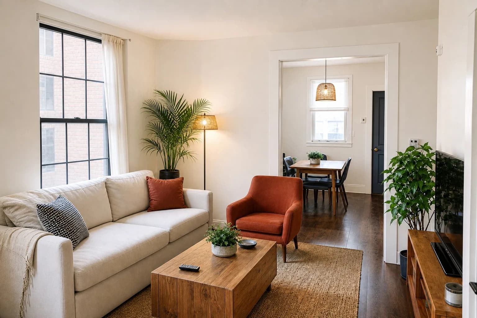
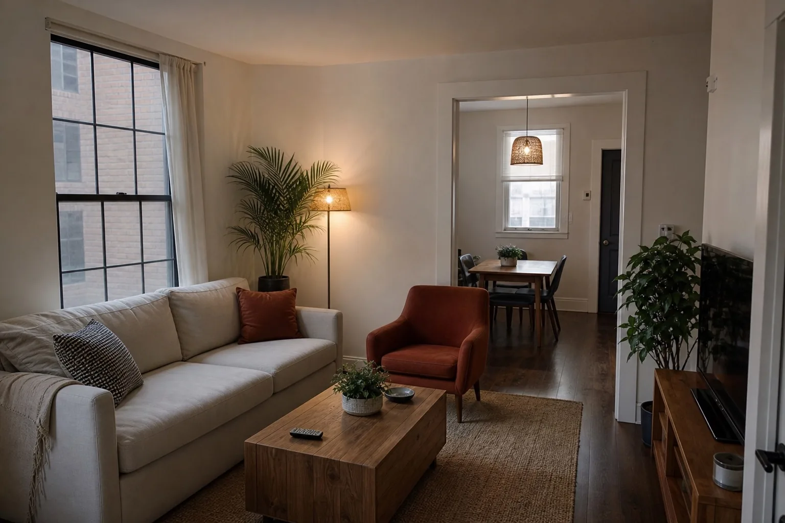
The problem
A gallery can feel inconsistent before viewers know why.
Different cameras, daylight conditions, and automatic filters make adjacent rooms look unrelated. Over-correcting everything to one brightness erases atmosphere and material differences.
Our method
Standardize the finish, not the rooms.
ListPik uses a restrained color and contrast direction across images while allowing a warm bedroom, cool bathroom, and shaded exterior to remain distinct.
Consistency is not uniformity
A coherent gallery is one where every image looks like it came from the same photographer on the same day. It is not one where every image has the same brightness. A north-facing bathroom is genuinely cooler and dimmer than a south-facing living room at noon, and correcting both to identical values produces a set that feels processed rather than consistent.
The thing that should match across a set is the finishing decision: the same contrast curve, the same restraint on saturation, the same approach to shadows. The rooms themselves should keep their character, because a viewer moving through the gallery is building a picture of a real building with real orientation.
Mixed sources are the normal case
Very few listings are shot entirely in one session on one camera. A typical set combines the agent's phone, the owner's older photos, something from a previous listing, and occasionally a professional frame or two. Each has a different colour response, and placed side by side in a gallery the difference is more noticeable than any individual image's flaws.
Bringing these to a common standard is usually more valuable than perfecting any single frame. The gallery is the unit of work, and the weakest transition between two adjacent photos is what a viewer notices.
- Process the full set together rather than one photo at a time
- Match to the best frame in the set rather than to an abstract ideal
- Keep genuine differences in room orientation and time of day
- Review the set as a strip, in the order it will be published
Where it fits
Use enhancement when the photograph is the problem.
The source is structurally useful
The camera position and important property details are already present, but the photographic finish is weak.
One correction carries the frame
The image needs a focused improvement in light, color, clarity, geometry, or presentation.
A reshoot is disproportionate
The listing deadline is close or one weak frame is holding back an otherwise useful set.
A three-part desk
Fast enough for the deadline. Deliberate enough for the listing.
- 01
Upload the original
Use the largest source file and choose an interior or exterior finishing direction.
- 02
Review the evidence
Inspect the result beside the source. The property should remain immediately recognizable.
- 03
Export with context
Download the approved image and follow the disclosure rules that apply to your listing.
Desk specification
What goes in, what comes back, and what to inspect.
Useful limits are part of a reliable workflow. Start from the best available source and approve the finished frame against visible property facts.
Before you publish
- View the whole set in publication order and look for jarring transitions.
- Confirm each room kept the character its orientation gives it.
- Check material colours are consistent across frames showing the same room.
- Verify saturation stayed restrained rather than drifting toward vivid.
Specific answers
What to know before processing.
Can I match photos from different phones?+
ListPik can reduce visible color and contrast differences when each source file is reasonably exposed and full resolution.
Will every image have identical brightness?+
No. Consistency means a coherent finish, not forcing every room and time of day into the same exposure.
Should I upload filtered photos?+
Use unfiltered originals whenever possible. Existing filters reduce the reliable color information available for correction.
Start with one frame
Let the comparison make the case.
Packs or optional monthly. One credit per finished photo. Review before you publish.
Open the studio